Selected Works
Wave to Earth
Graphic Design
2024
Wave to Earth is a flower arrangement brand offering a mystical service for those grieving the loss of a loved one. Through symbolic flowers and heartfelt messages, it creates a bridge between the living and the departed, providing comfort, peace, and connection in a deeply personal way. It's not just about flowers; it's about helping clients navigate grief and find meaning in life and death.
MYO
UX / UI
2024
A medical app inspired by Baymax from Big Hero 6, designed to provide real-time health monitoring, AI-driven virtual assistance, and comprehensive health management solutions. MYO aims to change personal healthcare by making it proactive, personalized, and accessible for a diverse range of users.
Empty Cup Studios
Design Production
2024
Empty Cup Studios brings the art of manual coffee brewing to your special event. With skilled baristas crafting bold espressos, smooth pour-overs, and velvety lattes, they offer a customizable, high-quality experience for any private function. From intimate gatherings to large celebrations, their eco-friendly practices and focus on exceptional service add a touch of luxury and sophistication to every occasion.
Kapé
Identity Design
2023
Kapé is a Wellington-based coffee company founded by passionate Filipinos. Offering authentic Filipino coffee, Kapé aims to introduce a new coffee culture to the city, breaking away from the typical café offerings. Their mission is to give New Zealanders a unique coffee experience to enjoy every morning.
01

- WAVE TO EARTH
- Title:Wave to Earth
- Year:2024
- Works:Identity, Collaterals
Brand Overview
Wave to Earth is a flower arrangement brand that operates in the delicate space between life and death, offering a mystical service that transcends the boundaries of this world. The brand is uniquely crafted for those who have experienced the profound loss of a loved one. Through symbolic flower arrangements and heartfelt messages, Wave to Earth creates a bridge between the living and the departed, providing comfort and connection in a deeply personal and magical way. This brand is not just about flowers; it is about guiding clients through their grief, helping them find peace and meaning as they navigate the mysteries of life and death.
Logo Introduction
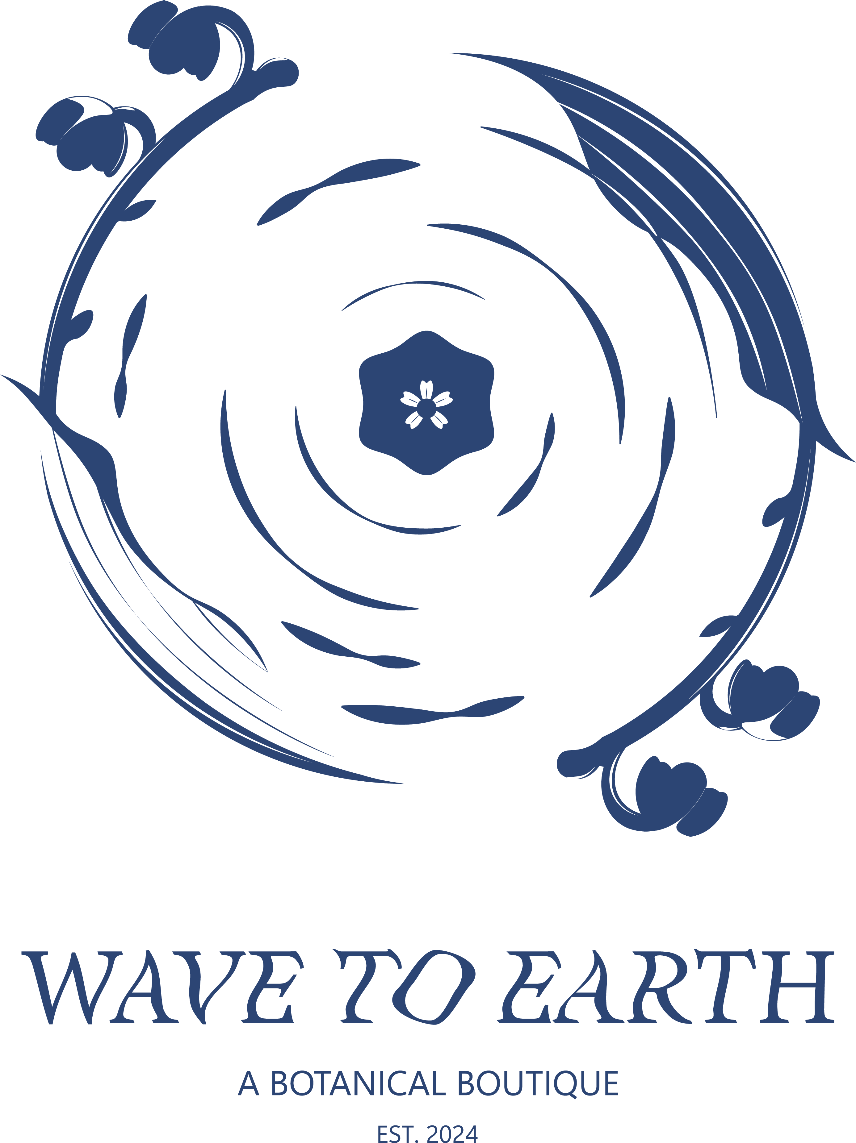
The Wave to Earth logo is a visual representation inspired by the gentle, expanding ripples that form in puddles when rain touches their surface. These ripples symbolize the suble yet profound connections between worlds, much like the core philosophy of the brand. Encircling the ripples are delicate stems of lily of the valley, my personal birth flower, chosen for its symbolic meaning of renewal, sweetness, and the return of happiness. The intertwining elements of water and flora in this design reflects both the fluidity of life and the beauty that remains after profound loss, harmonizing nature's elegance with the deeper, mystical essence of Wave to Earth.



Bell MT
Aa
Headline
Aa Bb Cc Dd Ee Ff Gg Hh Ii Jj Kk Ll Mm Nn Oo Pp Qq Rr Ss Tt Uu Vv Ww Xx Yy Zz
Louis George Cafe
Aa
Body
Aa Bb Cc Dd Ee Ff Gg Hh Ii Jj Kk Ll Mm Nn Oo Pp Qq Rr Ss Tt Uu Vv Ww Xx Yy Zz
Incense
Scented incense designed to accompany bouquets, enhancing the ritual of remembrance. Each fragnance is chosen to evoke tranquility, reflection, and a sense of connection with loved ones who have passed. The incence adds a sensory layer to the experience, making the act of communication more profound.
Ikebana
The main product of Wave to Earth is bouquets crafted in the style of Ikeana, the traditional Japanese art of flower arrangement. Each bouquet is designed with careful attention to balance harmony, and the natural beauty of the flowers, emphasizing the connection between nature, art, and emotion. The Ikebana bouquets serve as a deeply symbolic offering, with each arrangement reflecting the delicate balance between life and death. The minimalist and thoughtful design of Ikebana allows each flower to stand out, representing the unique and irreplacable nature of the departed loved one.
Project Process

- MYO
- Title:MYO
- Year:2024
- Works:Mobile App
App Overview
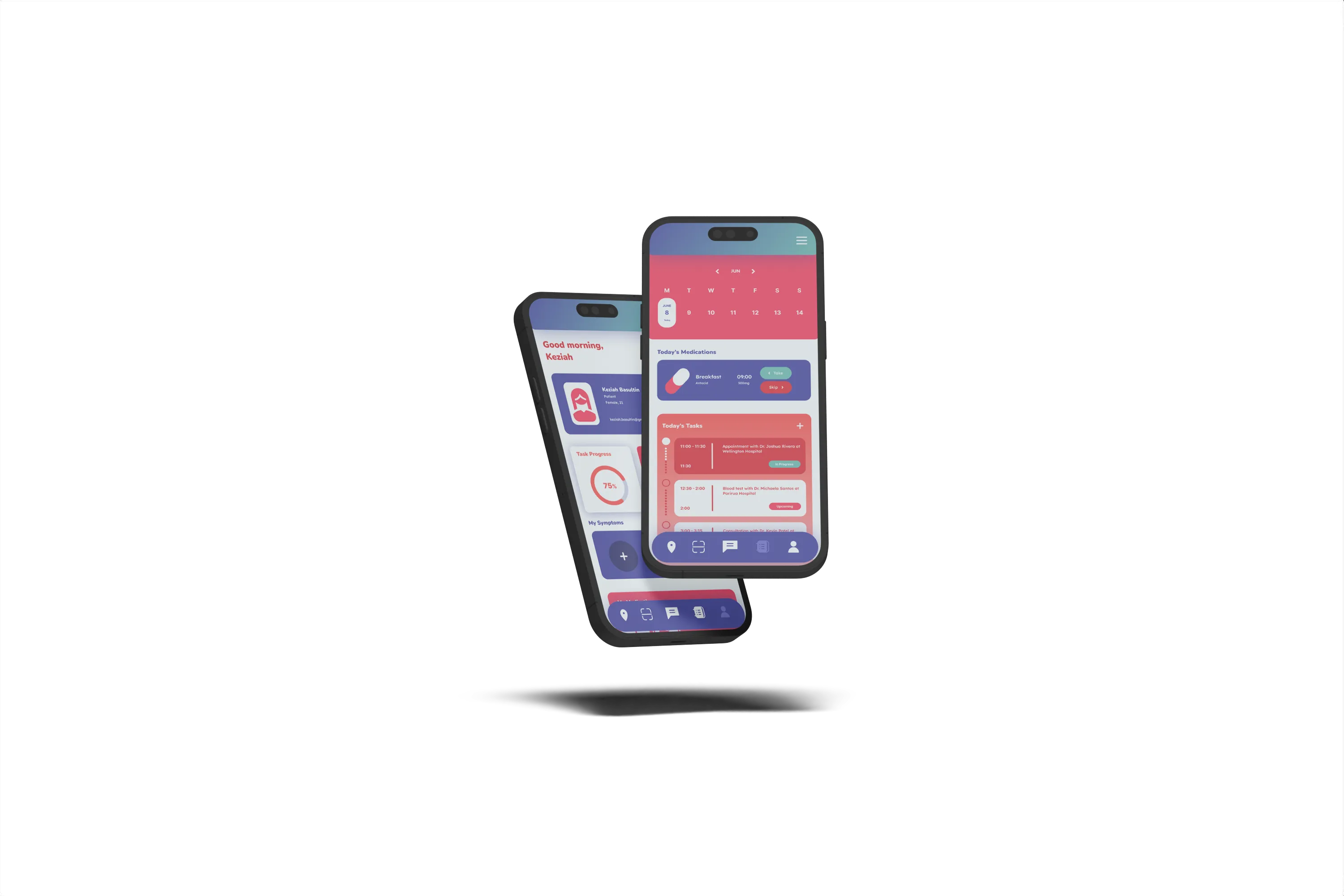
A medical app inspired by Baymax from Big Hero 6, designed to provide real-time health monitoring, AI-driven virtual assistance, and comprehensive health management solutions. MYO aims to change personal healthcare by making it proactive, personalized, and accessible for a diverse range of users.
Problem Statement
Many individuals find the difficulty in obtaining personalized and comprehensive healthcare. Traditional healthcare systems often struggle with long appointment wait times and limited access to healthcare professionals, especially in rural and underserved areas. These gaps can lead to delayed diagnoses, poor management of chronic conditions, and higher healthcare costs. MYO is a digital health solution that includes real-time health monitoring and AI-driven virtual assistance. The app leverages advanced technology and have a user-friendly interface, making healthcare more accessible, proactive, and personalized for a diverse range of users.
Your Personal
Health Companion
is here!
-
Real-Time Health Monitoring
Stay ahead of your health with instant insights into your vital signs. -
AI Virtual Assistance
Your personal health companion, always ready with advice, reminders, and support. -
Personalized Care Plans
Tailored to your unique needs, MYO makes health management easy and effective. -
Empower Yourself with Proactive Care
Whether it’s tracking chronic conditions, catching health issues early, or just living your healthiest life, MYO is here for you.
Colours

- Empty Cup Studios
- Title:Empty Cup Studios
- Year:2024
- Works:Design Production
Brand Overview
Empty Cup Studios brings the art of manual coffee brewing to your special event. With skilled baristas crafting bold espressos, smooth pour-overs, and velvety lattes, they offer a customizable, high-quality experience for any private function. From intimate gatherings to large celebrations, their eco-friendly practices and focus on exceptional service add a touch of luxury and sophistication to every occasion.
- Kapé
- Title:Kapé
- Year:2023
- Works:Identity Design
Brand Overview
Kapé is a Wellington-based coffee company founded by passionate Filipinos. Offering authentic Filipino coffee, Kapé aims to introduce a new coffee culture to the city, breaking away from the typical café offerings. Their mission is to give New Zealanders a unique coffee experience to enjoy every morning.